Chart Composer
Chart Composer is DataForeman’s powerful charting tool for visualizing and analyzing historical time-series data. Create custom charts, compare multiple data points, and save your configurations for reuse.
Overview
Chart Composer provides:
- Time-Series Visualization: Plot data over time with zoom and pan
- Multiple Tags: Display up to 50 tags on a single chart
- Real-Time Updates: Live mode for streaming data
- Interactive Analysis: Crosshair, zoom, and data point inspection
- Saved Charts: Create chart templates for reuse in dashboards
- Folder Organization: Organize charts into logical groups
- Export Options: Download chart data as CSV
Interface Components
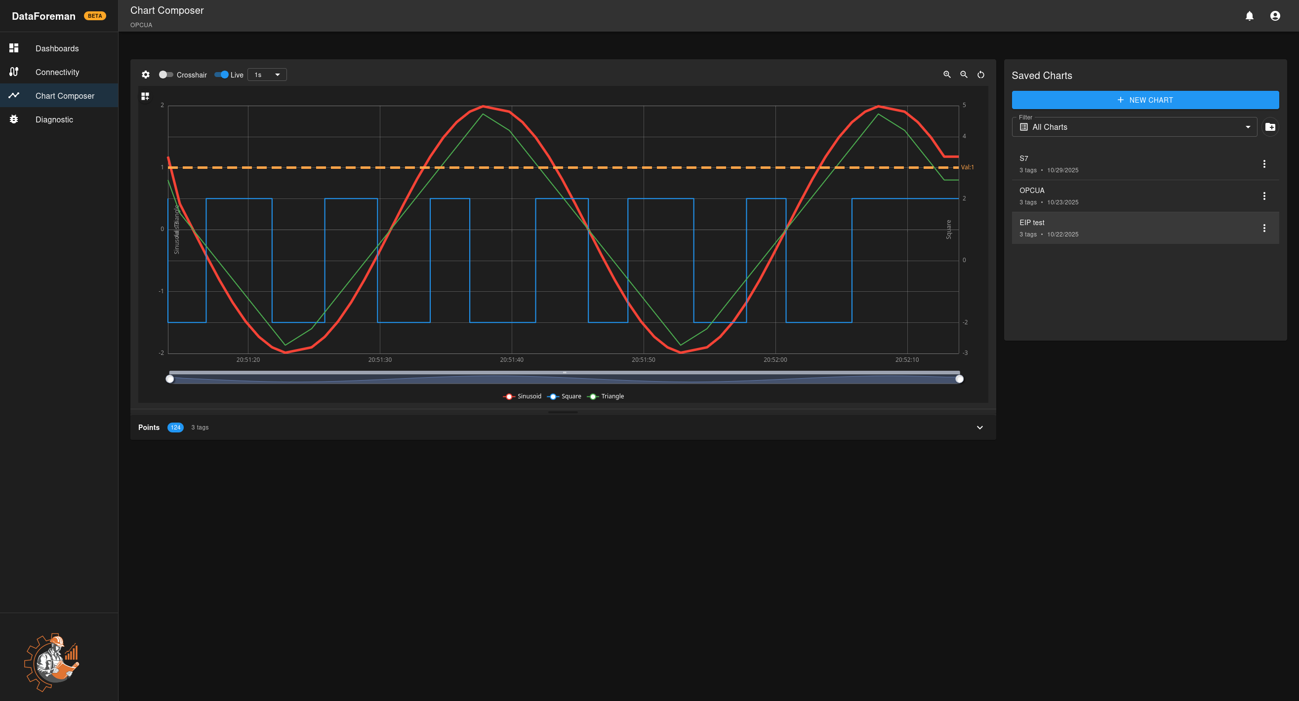
Chart Area
The main visualization area where your data is displayed:
- Time Axis (X): Horizontal axis showing time range
- Value Axis (Y): Vertical axis showing data values (auto-scaling or manual)
- Legend: Shows all plotted tags with colors and current values
- Crosshair: Interactive tool for precise value reading
Toolbar
Located above the chart:
- Compact Mode: Minimalist view with chart only
- Chart Preferences: Opens configuration panel with 5 tabs (Query List, Series, Display, Axes & Scaling, References)
- Crosshair Toggle: Enable/disable precision cursor
- Auto Refresh: Enable/disable automatic chart updates
- Zoom Controls: Zoom in, zoom out, reset view

Chart Preferences Panel
Click the Preferences button in the toolbar to access configuration options organized in tabs:
Query List Tab:
- Connection & Tag Selection: Select a connection, browse and add tags to the chart (up to 50 tags)
- Query Controls: Configure time range mode (Fixed/Rolling/Shifted), set time ranges, remove tags
- Query Optimization: Smart Compression toggle and Max Data Points setting
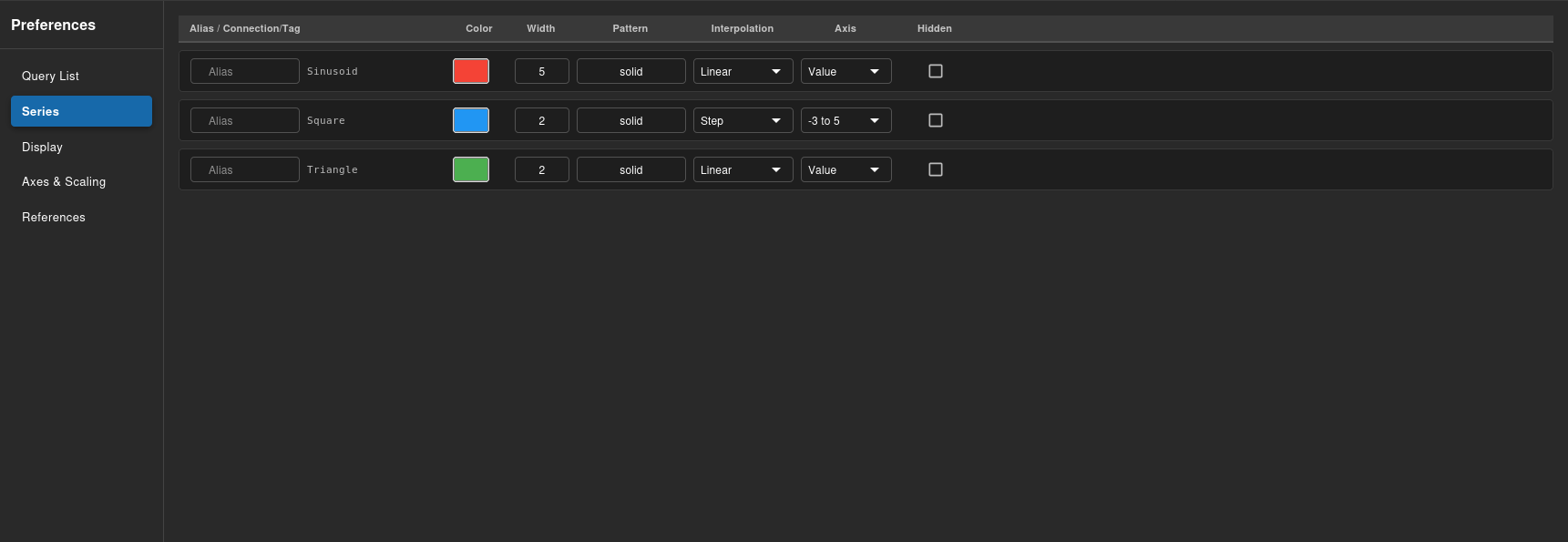
Series Tab:
- Configure individual tag display settings: alias, color, line style, axis assignment
- Show/hide individual tags
- Adjust line width and point markers per tag
Display Tab:
- Chart theme and background settings
- Legend position and visibility
- Grid lines configuration
- Animation settings
Axes & Scaling Tab:
- Add, edit, or remove Y-axes
- Configure axis orientation (left/right)
- Set auto-scaling or fixed min/max values
- Choose time tick density
References Tab:
- Add horizontal reference lines
- Set reference line values and colors
- Add labels to reference lines
Points Panel
Collapsible panel below the chart:
- Shows all data points returned from the query
- Organize data points by combining by time/fill-in nearest
- Export data as CSV
Saved Charts Panel
Right sidebar for managing saved charts:
- Browse existing saved charts
- Load charts into composer
- Create new chart folders
Creating a Chart
Step 1: Add Tags
- Click the Preferences button in the toolbar above the chart
- In the Query List tab, select a connection from the dropdown in the Connection & Tag Selection section
- Browse or search for tags you want to chart
- Select tags using checkboxes (up to 50 tags)
- Click Add to Chart button to add selected tags to your chart
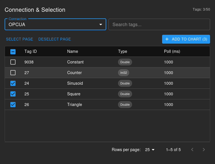
Note: System tags cannot be mixed with tags from other connections on the same chart, as they are stored in different database tables. This limitation will be addressed in a future release. To chart system tags alongside device tags, create separate charts and use dashboards to view them together.
Step 2: Configure Time Range
In the Query Controls section of the Query List tab, choose your time range mode:
- Fixed: Specify exact start and end date/times using date pickers
- Rolling: Show last N mins/hours/days that updates when you query (e.g., “Last 24 Hours from now”)
- Shifted: Show a past time window (e.g., “24 hours starting from 1 day ago”)
For Fixed mode, use the date pickers to set start and end times. For Rolling/Shifted modes, set the duration in minutes using quick preset buttons or the duration field.
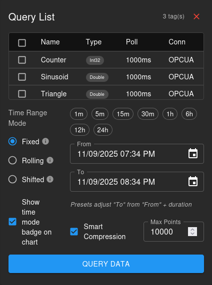
Step 3: Query Data
- Click the Query button in the Query Controls section
- Data loads and displays on the chart
- Close the Preferences panel to see the full chart
- Use zoom controls to focus on specific periods
Step 4: Optimize Performance (Optional)
In the Query Controls section, configure query optimization:
- Smart Compression: When enabled, intelligently samples data using the Min/Max Envelope algorithm while preserving peaks and valleys
- Max Data Points: Set the maximum number of data points to return (100-50,000)
- With Smart Compression ON: Points distributed proportionally based on tag poll rates
- With Smart Compression OFF: Points distributed evenly across tags
Step 5: Save Chart
- Click Save Chart button (or the save icon if unsaved changes are present)
- Enter a chart name and description
- Optionally select a folder in the Saved Charts panel
- Click Save
Chart Features
Interactive Analysis
Zoom and Pan:
- Mouse Wheel: Zoom in/out on time axis
- Click and Drag: Pan left/right through time
- Box Zoom: Click and drag on chart area to zoom to selection
- Reset: Click reset button to restore original view
Crosshair Mode:
- Enable crosshair for precise value reading
- Hover over chart to see exact time and values
- Values appear in legend for all tags at cursor time
- Useful for comparing multiple tags at specific moments
Data Point Inspection:
- Click any data point to see details
- View exact timestamp and value
- See data quality indicator
- Access tag metadata
Auto Refresh
Automatic chart updates:
- Enable Auto Refresh toggle in toolbar
- Chart automatically re-queries at the configured interval
- Choose refresh interval: 5s, 10s, 30s, 1m, 5m, or custom
- Useful for monitoring real-time data in Rolling or Shifted time modes
- Disable to stop automatic updates and analyze historical data
Note: Auto Refresh re-runs the entire query. For Rolling mode, this shows the latest data window. For Fixed mode, it refreshes the same time range.
Tag and Axis Configuration
Click the Preferences button to access advanced chart configuration:
Series Tab:
- Configure individual tag settings: alias, color, line style, line width
- Assign tags to specific Y-axes
- Show/hide individual tags without removing them
- Adjust point markers and interpolation methods per tag
Axes & Scaling Tab:
- Add multiple Y-axes for tags with different units or scales
- Configure axis orientation (left/right)
- Set auto-scaling or fixed min/max values
Display Tab:
- Customize chart appearance and theme
- Enable/disable grid lines (horizontal, vertical, or both)
- Adjust animation and transition settings
References Tab:
- Add horizontal reference lines for targets or thresholds
- Set reference line values, colors, and labels
- Useful for marking limits, setpoints, or specification ranges
Organizing Charts
Folders
Keep charts organized:
- Click Create new folder in Saved Charts panel
- Name your folder (e.g., “Production”, “Quality”, “Maintenance”)
- Move charts into folders by clicking the 3-dot menu next to each chart in the Saved Charts panel and selecting “Move to Folder”
- Create subfolders for deeper organization
Advanced Features
Min/Max Envelope
For high-frequency data:
- Automatically compresses data while preserving extremes
- Shows min/max range as shaded area or error bars
- Reduces chart clutter for long time ranges
- Maintains visibility of peaks and valleys
Write-on-Change Visualization
For sparse data:
- Extends last known value as horizontal line
- Shows when data point changes vs when sampled
- Ideal for setpoints and status values
- Configurable per tag
Data Aggregation
For long time periods:
- Automatic bucketing into time intervals when Smart Compression is enabled
- Preserves min/max extremes in each time bucket
- Reduces chart clutter for wide time ranges
- Maintains visibility of peaks and valleys critical for troubleshooting
Exporting Data
CSV Export
Download chart data from the Points panel:
- Query the data you want to export
- Expand the Points panel below the chart
- Configure data organization:
- Combine By: Time (single timestamp column) or Tag (one row per timestamp+tag)
- Fill-in: Nearest (fill gaps with nearest value) or None (leave gaps empty)
- Click Export Raw to download all queried data points
- Or click Export As Shown to download only data matching your current view settings
- Open the CSV file in Excel or analysis tools
Export Options:
- Raw Export: All data points as returned from the database
- As Shown Export: Filtered/organized data matching your Points panel configuration
Performance Tips
Optimizing Chart Performance
-
Limit Time Range:
- Query only the time period you need
- Use zoom for detailed analysis of subsets
-
Reduce Tag Count:
- Keep to 10 or fewer tags per chart for best performance
- Use multiple charts for large datasets
-
Appropriate Aggregation:
- For wide time ranges, use hourly or daily buckets
- Raw data works well for short periods (< 24 hours)
-
Browser Performance:
- Close unused charts
- Use hardware acceleration in browser
- Consider using Compact Mode for smoother rendering
Troubleshooting
No Data Displayed
- Check Time Range: Verify data exists for selected period
- Verify Tags: Ensure tags are actively collecting data
- Connection Status: Check device connectivity
- Query Errors: Look for error messages in browser console
Chart Performance Issues
- Reduce Data Points: Use aggregation for long periods
- Limit Tags: Remove unnecessary tags from chart
- Close Other Charts: Free up browser memory
- Update Browser: Use latest version of Chrome, Firefox, or Edge
Data Quality Issues
- Check Source: Verify device is sending good data
- Quality Indicators: Look for “Bad” or “Uncertain” markers
- Connection Logs: Review connectivity logs in Diagnostics
- PLC Status: Ensure PLC is in RUN mode
Best Practices
Chart Design
- Use Meaningful Names: “Line 1 Temperature Trend” vs “Chart 1”
- Color Coding: Consistent colors for similar tag types
- Tag Grouping: Related tags on same chart
- Time Ranges: Match analysis goals (hour for troubleshooting, week for trends)
Analysis Workflows
- Wide to Narrow: Start with broad time range, zoom to details
- Comparison: Use multiple Y-axes for different units
- Annotation: Document findings in chart descriptions
- Sharing: Save charts to folders accessible to your team
Data Quality
- Regular Review: Check charts daily for anomalies
- Validation: Compare with other data sources
- Calibration: Note when sensors are calibrated
- Maintenance: Document equipment maintenance in chart notes
Next Steps
- Use charts in Dashboards for monitoring
- Configure data collection in Device Connectivity
- Learn about the Min/Max Envelope Algorithm
- Explore Axes Scaling Features