Dashboard Creation & Management
Dashboards in DataForeman provide a customizable interface for visualizing real-time and historical data from your industrial devices. Organize your visualizations into folders and create as many dashboards as you need.
Overview
Dashboards allow you to:
- Create custom layouts with multiple charts and widgets
- Organize dashboards into folders for better management
- View real-time and historical data side-by-side
- Share dashboards with team members (based on permissions)
- Export dashboard data for reporting
Creating Your First Dashboard
Step 1: Navigate to Dashboards
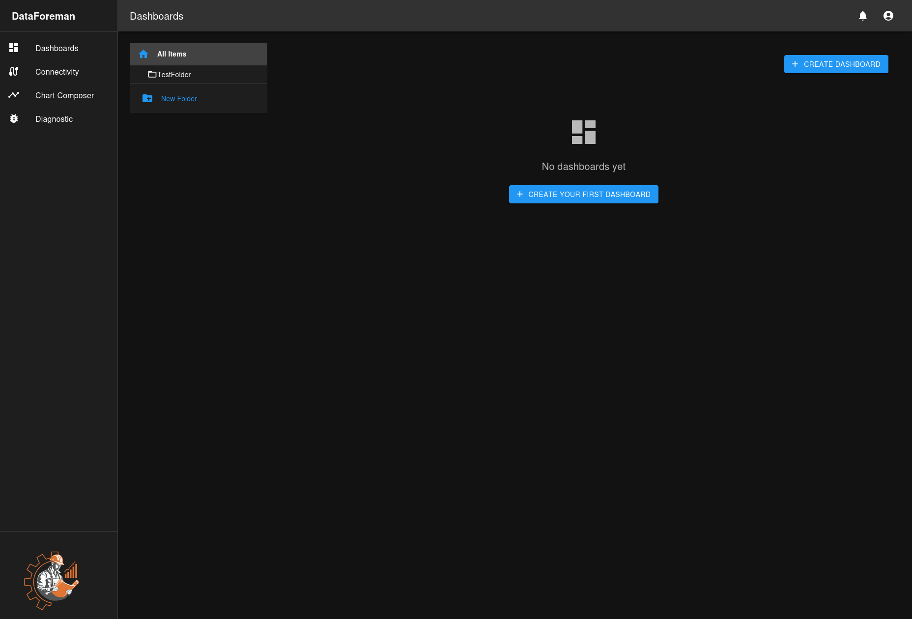
Click the Dashboards icon in the left sidebar to access the dashboard management interface.
Step 2: Create a New Dashboard
- Click the CREATE DASHBOARD button in the top-right corner
- Enter a dashboard name and description (optional)
- Optionally, check Share with other users to make the dashboard visible to others
- Click Create to save
Note: Dashboards are created in the root folder by default. After creation, you can move them to folders using the folder menu.
Step 3: Add Charts to Your Dashboard
Once your dashboard is created:
- Click Edit button (pencil icon) in the top-right to enter edit mode
- Click Add Chart button
- In the Chart Library sidebar, browse and search for saved charts from Chart Composer
- Click the + icon next to a chart to add it to your dashboard
- Charts appear as widgets on a grid layout

Step 4: Arrange Your Layout
In edit mode:
- Drag widgets to reposition them by clicking and holding the 6-dot drag handle (::) at the left of the widget header
- Resize widgets by dragging their corners
- Select multiple widgets (checkboxes) to sync their time ranges
- Click Save to preserve your layout
Organizing with Folders
Creating Folders
- Click New Folder in the left panel
- Enter a folder name
- Optionally, select a parent folder for nested organization
- Click Create
Managing Folders
- Create Subfolder: Hover over a folder and click the subfolder icon
- Edit Folder: Click the pencil icon to rename
- Delete Folder: Click the trash icon (dashboards inside will be moved to parent or root)
Dashboard Features
View Mode
In view mode, dashboards display your data cleanly without editing controls:
- Charts display in compact mode without toolbars
- Click the Edit icon to open a chart in Chart Composer for detailed analysis
- Widgets show chart name in title bar (can be hidden in edit mode)
- Clean layout optimized for monitoring
Edit Mode
Edit mode allows you to customize your dashboard layout:
- Drag widgets to reposition them by clicking and holding the 6-dot drag handle (::) at the left of the widget header
- Resize widgets by dragging their corners
- Add new charts from your saved collection via Chart Library sidebar
- Remove widgets using the X button on each widget
- Select multiple widgets (checkboxes) to create time sync groups
- Toggle widget title visibility using the eye icon
- Click Save to preserve changes

Edit Toolbar:

Widget Controls in Edit Mode:

Widget Grid:
- Responsive grid layout with 12 columns
- Widgets snap to grid positions
- Minimum size: 2x2 grid units
- Maximum size: 12x12 grid units (full width)
Sharing & Permissions
Dashboards respect the DataForeman permission system:
- Read permission (
dashboards:read): View dashboards - Create permission (
dashboards:create): Create new dashboards - Update permission (
dashboards:update): Edit dashboard name, description, and layout - Delete permission (
dashboards:delete): Delete dashboards
Shared Dashboards:
- Check Share with other users when creating a dashboard to make it visible to others
- Shared dashboards appear in the Shared with Me section for other users
- Only the dashboard owner can edit or delete a shared dashboard
- Other users can view shared dashboards in read-only mode
Exporting Dashboards
DataForeman provides image export for dashboards:
- Click the Export button (download icon) in the toolbar
- Choose format: PNG (lossless), JPG (smaller file), or PDF document
- Select quality: Low (faster, smaller), Medium (balanced), or High (best quality)
- Click Export
- The dashboard image downloads to your computer
Export captures:
- Current dashboard layout as displayed
- All visible widgets without toolbars
- Clean presentation suitable for reports or presentations
Note: This exports a static image. To export chart data as CSV, open individual charts in Chart Composer and use the Points panel export feature.
Advanced Features
Time Sync Groups
Synchronize time ranges across multiple widgets:
- Enter edit mode
- Select multiple widgets using checkboxes
- Click Sync Time button
- Choose time range mode and settings
- Synced widgets display with colored dots (same color = same group)
- When one widget’s time range changes, all widgets in the group update
Note: Time sync groups are temporary troubleshooting tools and are not saved with the dashboard.
TV Mode
Display dashboards in fullscreen with auto-rotation:
- Click the TV Mode button (fullscreen icon) in the toolbar
- Configure rotation settings:
- Select which dashboards to include in rotation
- Set rotation interval (seconds between dashboards)
- Choose whether to auto-rotate
- Click Start TV Mode
- Move mouse to show controls, click Exit to return to normal view
TV Mode features:
- Fullscreen display without toolbars
- Auto-rotation through selected dashboards
- Clean presentation for monitoring displays
- Widgets display at configured sizes
Widget Customization
In edit mode, customize individual widgets:
- Title Override: Change the displayed title without affecting the chart name
- Hide Title: Toggle title visibility using the eye icon (useful for maximizing chart space)
- Time Range Override: Apply custom time ranges to specific widgets (via time sync groups)
Tips & Best Practices
-
Organize Strategically: Use folders to group dashboards by:
- Production line or area
- Equipment type
- Shift or department
- Process stage
-
Optimize Performance:
- Limit widgets per dashboard for best performance (6-8 recommended)
- Use Smart Compression in charts for long time ranges
- Configure appropriate Max Data Points in Chart Composer
- Consider separate dashboards for different monitoring purposes
-
Naming Conventions: Use clear, descriptive names like:
- “Line 1 - Production Overview”
- “Boiler System - Real-Time”
- “Quality Metrics - Daily”
-
Regular Cleanup: Archive or delete unused dashboards to keep the interface manageable
Troubleshooting
Dashboard Won’t Load
- Check Permissions: Ensure you have read access to the dashboard
- Verify Charts: Make sure all charts in the dashboard still exist
- Check Data Source: Confirm the devices are connected and sending data
Charts Not Updating
- Auto Refresh: Charts in dashboards don’t have independent auto-refresh. Open the chart in Chart Composer to enable Auto Refresh for that chart.
- Data Availability: Verify data exists for the selected time range
- Browser Console: Check for JavaScript errors (F12)
- Chart Configuration: Ensure the chart’s query is configured correctly in Chart Composer
Layout Issues
- Clear Cache: Try refreshing the page (Ctrl+F5 or Cmd+Shift+R)
- Browser Compatibility: Use a modern browser (Chrome, Firefox, Edge)
- Screen Resolution: Some layouts may need adjustment for different screen sizes
- Widgets overlapping: Enter edit mode and manually reposition widgets
Next Steps
- Learn how to create charts in the Chart Composer
- Connect devices in Device Connectivity
- Manage user access in Permission System